Show a Modal in Vue
A modal is a pop-up built entirely in JavaScript. Vue makes it easy to build a modal component using Vue slots. Click the below button to see a basic modal.
Building A Modal Component
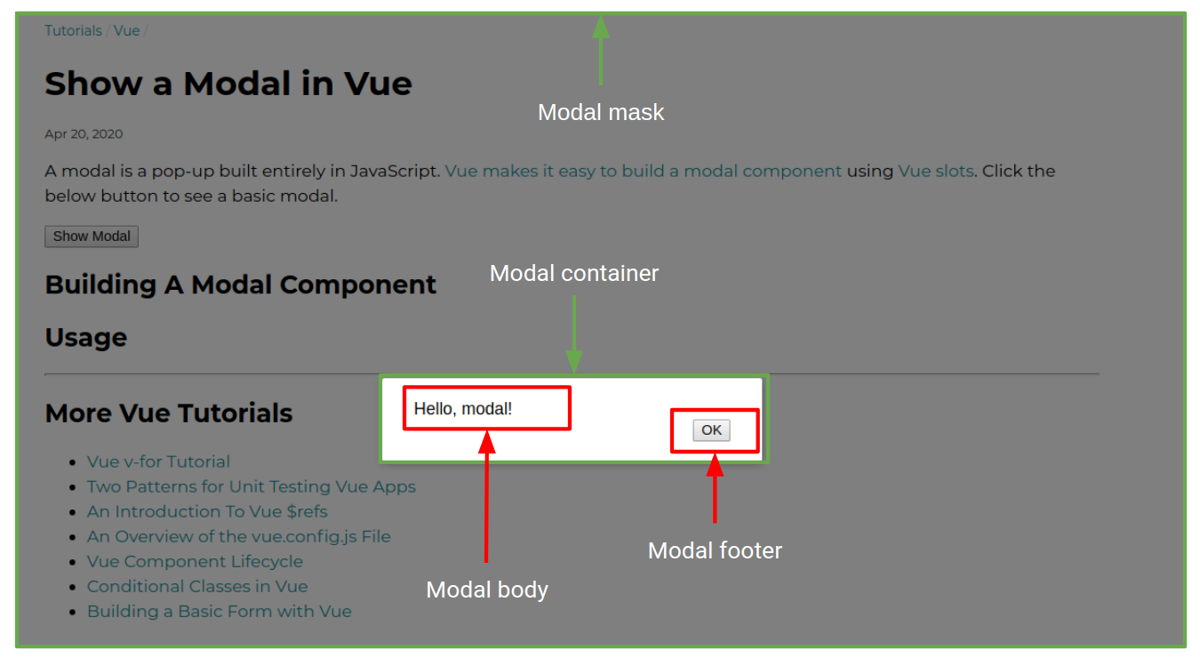
The modal component can be broken down into 4 important elements: the mask, the container, the header, and the footer. Here's how these elements appear on the screen.

The mask is the grey background that partially hides the page, and the container is the white box that contains the header and footer. Below is the CSS for the above modal, slightly modified from this page.
.modal-mask {
  position: fixed;
  z-index: 9998;
  top: 0;
  left: 0;
  width: 100%;
  height: 100%;
  background-color: rgba(0, 0, 0, 0.5);
  display: table;
  transition: opacity 0.3s ease;
}

.modal-wrapper {
  display: table-cell;
  vertical-align: middle;
}

.modal-container {
  width: 300px;
  margin: 0px auto;
  padding: 20px 30px;
  padding-bottom: 40px;
  background-color: #fff;
  border-radius: 2px;
  box-shadow: 0 2px 8px rgba(0, 0, 0, 0.33);
  transition: all 0.3s ease;
}

.modal-default-button {
  float: right;
}

/*
 * The following styles are auto-applied to elements with
 * transition="modal" when their visibility is toggled
 * by Vue.js.
 *
 * You can easily play with the modal transition by editing
 * these styles.
 */

.modal-enter {
  opacity: 0;
}

.modal-leave-active {
  opacity: 0;
}

.modal-enter .modal-container,
.modal-leave-active .modal-container {
  -webkit-transform: scale(1.1);
  transform: scale(1.1);
}
The modal component is a standard Vue component with 2 named slots: header
and footer. Below is the modal component definition.
Vue.component('modal', {
  template: `
  <transition name="modal">
    <div class="modal-mask">
      <div class="modal-wrapper">
        <div class="modal-container">
          <div class="modal-body">
            <slot name="body">
            </slot>
          </div>

          <div class="modal-footer">
            <slot name="footer">
              <button class="modal-default-button" @click="$emit('close')">
                OK
              </button>
            </slot>
          </div>
        </div>
      </div>
    </div>
  </transition>
  `
});
The modal component doesn't do much by itself. It just exposes
2 named slots. The footer slot has a default value that emits a
'close' event whenever the user clicks the 'OK' button.
Usage
How do you actually use this modal component? You need to conditionally render this component using v-if, because, if the modal component is rendered, the mask will hide the page. Below is the
Vue app that powers this page's modal:
const app = new Vue({
  data: () => ({ showModal: false }),
  template: `
    <div>
      <button @click="showModal = true">Show Modal</button>
      <modal v-if="showModal" @close="showModal = false">
        <template v-slot:body>
          Hello, modal!
        </template>
      </modal>
    </div>
  `
});
app.$mount('#vue-modal-example');
The v-if directive tells Vue to only mount the modal if setModal is true.
Clicking the button sets showModal = true, which tells Vue to mount the
modal. The <template v-slot:body> tells Vue what HTML to render in the
body slot. Since there's no footer slot, Vue uses the default footer HTML.
Finally, once the modal emits a 'close' event, this template is responsible
for hiding the modal. The modal component is not allowed to close itself,
the calling code is responsible for hiding it.
